My 3 Favorite Patio Ideas from the NWFGS
The Northwest Flower and Garden Show is a highlight in the Seattle gardening calendar with an exciting blend of the 'out of this world' (and budget), innovative, thought provoking and great ideas for ongoing projects in our own garden.
These are my top 3 'take-away' patio ideas. That's not to say that they are all 100% my style but there are elements that appealed to me and gave me ideas for integrating something fresh into my own designs
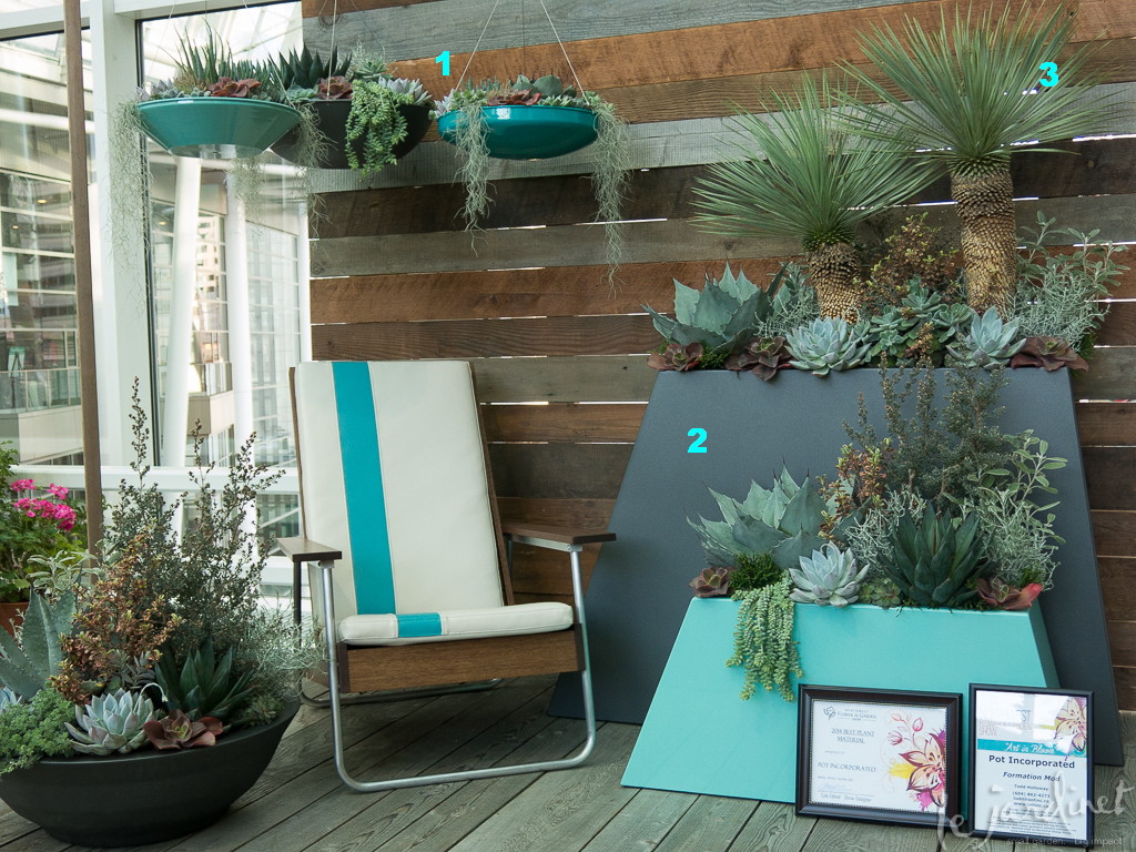
Formation Mod by Todd Holloway, Pot Incorporated
A fun blend of rustic, contemporary and retro. Here's what I liked;
1. Hover planters -a new interpretation of the hanging basket. These are available in several bold colors and different profiles. I liked the idea of grouping them at the side of a patio rather than the traditional solo basket hung on a porch. They are probably best suited to shallow rooted plants such as succulents and other heat loving plants since the soil volume is relatively low and the metal will get hot in full summer sun. However having planted a conical succulent container last summer for the first time I really enjoyed having something that required less water.
2. New container shapes – a welcome change from the more predictable cubes and rectangles, these extend the range of possibilities for contemporary designs. They are approx 12" front to back so will fit nicely against a wall, creating a big impact from a relatively small footprint – a great option for balconies. I also liked the contrast with the shape of the low bowl.
3. Asymmetrical planting – this shape lends itself well to off-center planting. Notice how the lines of the plants extend the lines of the containers.
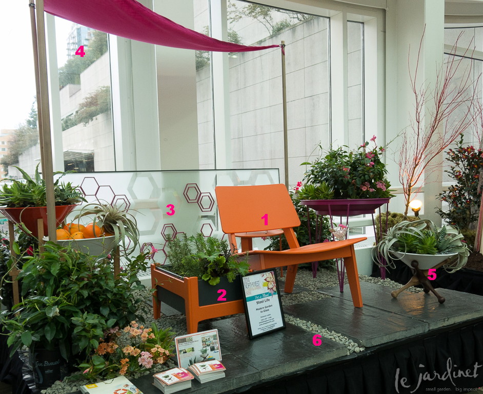
Modern Garden to Glass by Shannon Lester, Steel Life
Lots of fun ideas here and it shows how you can take a number of different elements and tie them together with color. I can see this really appealing to the younger homeowners. Here's what I liked;
1. Great colors! Orange, magenta, red and white – WOW! Dare to be different and never mind what your grandma told you.
2. Side 'table' of edible plants. Snack while you sit.
3. Semi-translucent screen with a really neat hexagon design. What a great option to plain glass on balconies especially where privacy is needed from neighbors who live downhill or opposite yet it still allows light through. This could easily be re-interpreted as a taller privacy screen too. The hexagon design is interesting yet not distracting.
4. Overhead sail canopy – easy to do even on a small patio
5. Fun steel containers in assorted colors, shapes and stands. I love the stand of the container at the front which reminds me of the game of Jacks that I used to play as a child.
6. Patio design – combination of pebbles and stone slabs in a random design
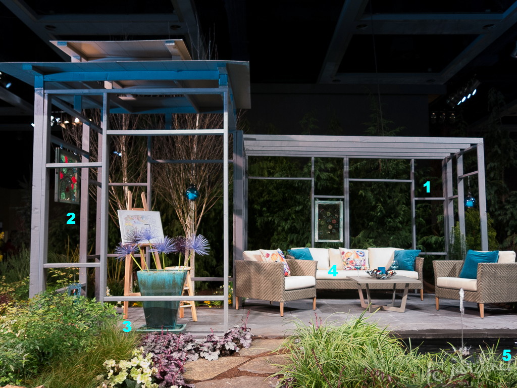
Monet Dreamed Here by Kristy Ditmore (Under the Arbor Landscape Design), Jamie McAuliffe (McAuliffe's Valley Nursery), Rick Perry (Falling Water Designs)
Of the three patios featured here this is perhaps the one which resonates the most with me. I love the connection of the semi-enclosed structure with a more open patio. In this instance it has been designed as an artists studio and sitting area but could equally be used to define spaces such as a dining/sitting or sitting/fire pit combination. Here's what else I loved;
1. The framing – the spaces between pergola posts are usually left open or filled with some sort of trellis work. I loved this idea which creates a series of 'picture frames' through which to view the garden. Each scene will be slightly different. This would be especially useful in a larger garden such as our own where the expanse needs to be brought down to a human scale.
2. Glass panels/art work hung from some of the frames – another way to create a sense of intimacy, soft boundaries and a true outdoor room. These could be developed as privacy panels where needed.
3. The color and shape of the container. This is a favorite of mine from AW pottery. The color is called Falling Turquoise and has shades of rich blue, turquoise and brown in an irregular streaked design. It is only ~12" deep so fits easily into the smallest of spaces.
4. Furniture/colors – I see a lot of dark toned all-weather wicker furniture on the market so this softer shade was a lovely change and really added to the overall peaceful color palette. Loved those painterly – patterned throw pillow too – must find out where they came from!. Really very 'me' although light colored patio cushions would be a disaster. Maybe I'd do those in the turquoise instead and use plain cream throw pillows.
5. Water feature – water by a patio is always welcome and I liked the simplicity of this.
What were your favorite take-home ideas from the shows this year?


Great observations! After reading through the first one, I tried to test myself with the following 2 others. Reading gardening blogs helps to amp up my awareness of the infinite world of possibilities.
Michaele, I find its easy to dismiss a design because I don't like everything about it, yet there are usually elements that do appeal and I can learn from. I'm glad you enjoyed the post
A speaker at the Home and Gardens Show in Birmingham recently mentioned the bright colors on the horizon. "Get ready," she said, "They are going to blow you away!" I see that in your photos. It's a good thing, because I love color in the garden. My favorite, of course, is turquoise, which combines well with orange, purple, red, yellow, green, and white. Can we call turquoise the new neutral?
Karen, I forgot to answer the question you asked about my daffodils. I did plant them over a space of several years, but they have also naturalized. I haven't done it this year, but I also made a habit of digging some up as they emerged each year and transplanting to new areas. Thank you for your kind comment!