Fearless Design- secrets to using bold color in the garden
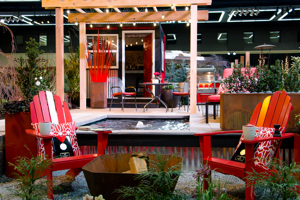
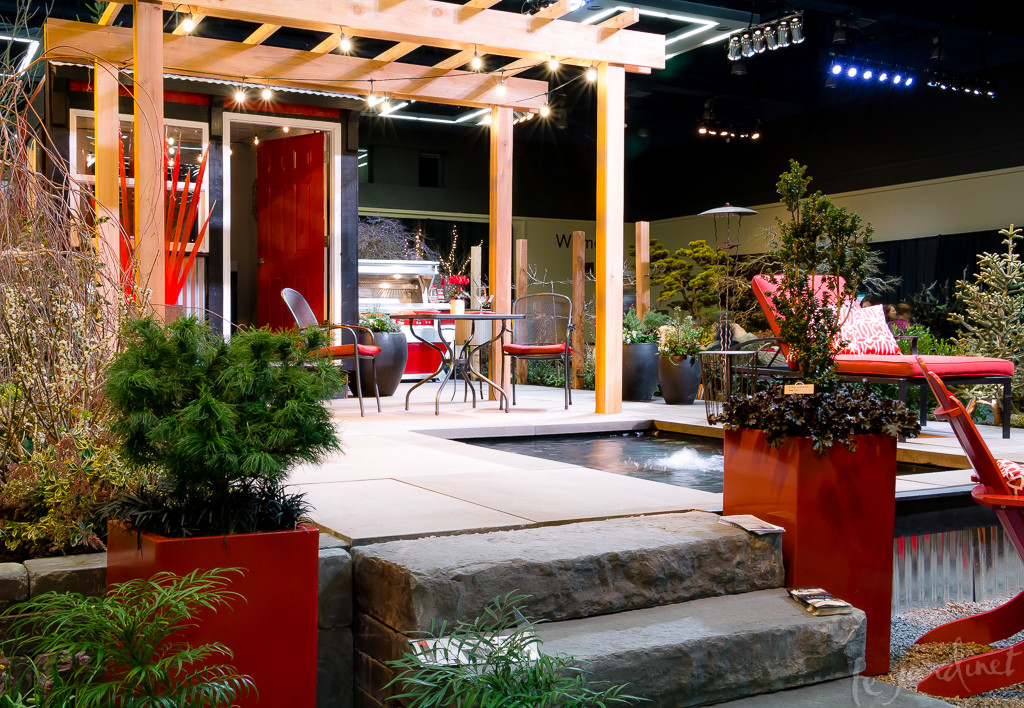
The Northwest Flower and Garden Show is always a source of inspiration and this year was no exception. One display garden that really caught my eye was called Contained Excitement, designed by my good friend and former colleague Lori DeLeuw (Designs by deLeuw) and David Rogers (Issaquah Landscaping).
This was their design statement:
Here’s the perfect counterpoint to our hectic lifestyles.
Hone your culinary skills in the outdoor kitchen, preparing healthy dishes using edibles grown in containers just steps away. And work off the stress of the daily grind with a swim in the outdoor lap pool…which also “doubles” as a tranquil spot to just plain relax!
Unusual, yet appropriate, plant material blends with finished wood and metalwork to create a distinctively modern design. As the night winds down, gather with friends at the fire pit for good conversation and an aperitif. If it begins to drizzle, simply move the party into the sleekly-styled shelter for cover!
Take-home ideas: Creating discreet outdoor areas within a garden using plantings and hardscape materials.
While they clearly achieved their goal and I love the many outdoor spaces they created, my own take-home ideas were more about their remarkable and fearless use of a vivid color without the garden looking like a paintbox explosion! Pillar-box red was the theme color, boldly used on the walls of a chic shed, garden furniture, a glossy BBQ, containers, soft furnishings and many accessories including a stunning glass installation by artist Jesse Kelly. Having spent some time analyzing it here's why I feel it works:
- Most of the bold red appears on vertical elements, the horizontal patio spaces being in neutral grey tones. The addition of a red rug would have been too much of a good thing!
- Bold black trim and shiny galvanized metal panels add a contemporary flair, enhanced by strong geometric lines, this strong design aesthetic becoming the over-riding focus.
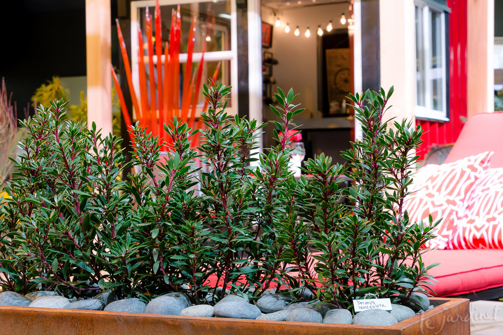
- Incorporation of rusted metal containers and a fire pit give a nod to red tones yet add variety by allowing for an orange hue.
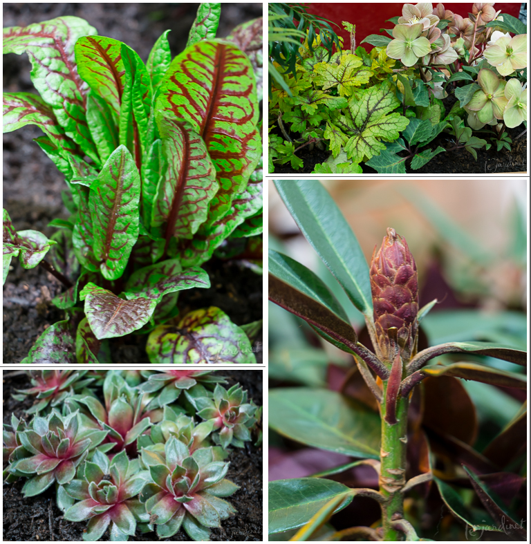
- It's all in the details. I can see Lori's hand in this so clearly! She is an excellent container and landscape designer and knows that a cohesive design is about the subtle color echoes between foliage, flowers, stems, and more. I love how she carried the red theme into the plant palette, yet did so in an understated manner. A casual glance would assume the plantings are in shades of green, yet the mosaic below tells a different story to the careful observer.
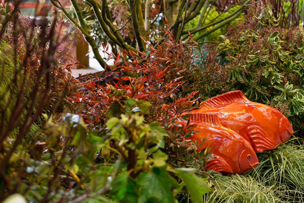
- There is still room for fun! There are times when a design statement becomes so rigid that there is no allowance for serendipity or an unexpected moment. With a clear contemporary design and red-green-black-silver color scheme, the designers still allowed themselves the whimsy of a couple of orange goldfish swimming through the plants! Yes they could have use red fish. I love that they didn't.
Congratulations on being awarded a silver medal at the show as well as the Sunset Western Living® Award. Very well deserved!
Thanks, Karen. We weren't able to make it to the garden show this year and appreciate your sharing what turned out to be a highlight for you. While a picture is worth a thousand words, your words and interpretation were delightful and brought the picture into better focus. You do have a way with the written word!!!
Sorry you missed it this year – glad you enjoyed reading about it
[…] you enjoyed my last post on Fearless Design – secrets for using bold color in the garden but wondered how those ideas could be translated to even smaller spaces, this post is for […]