Big Ideas for Balcony-Sized Spaces
It's Showtime here in Seattle! The Northwest Flower and Garden Show is always a seasonal highlight for garden lovers and dreamers with so many ideas to help you make the most of your space no matter how large or small.
The City Living display features ten patio gardens, each just 6' x 12', typical of a balcony, deck or petite courtyard. Designers are invited to create a unique outdoor living space suitable for relaxing and entertaining. While every single display offered inspiration, as one of three judges, I was asked to select help winners for two specific awards – Best Design and Best Plant Material. I thought you'd like to see which displays we chose and why.
Best Design: Rock the Casbah
The criteria we were looking for included the following:
- Is the exhibit unique and memorable?
- Does it utilize the space well?
- Are furniture and accessories in scale with the size of the garden?
- Is color carefully considered and effectively used?
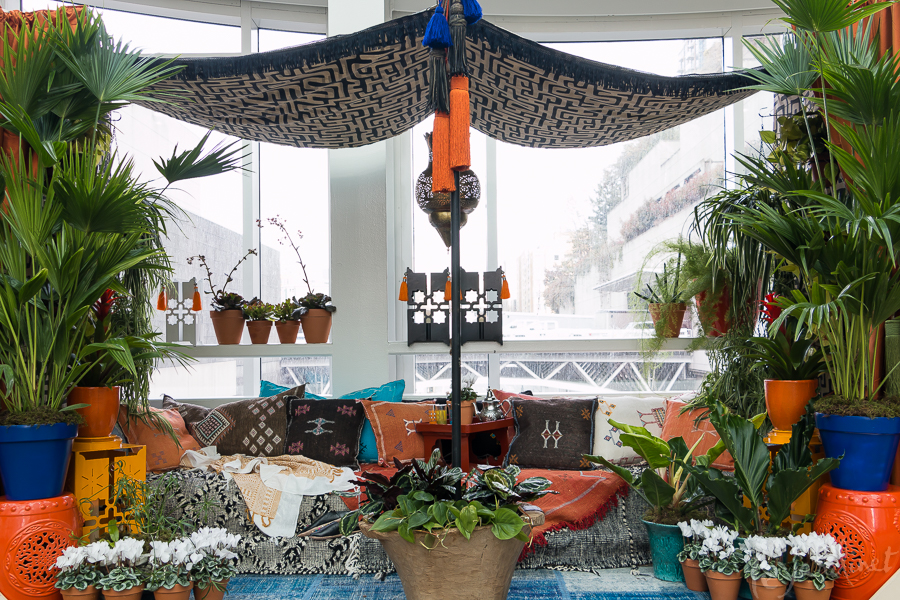
As we looked at the seductive layers of textiles, lush foliage and creative use of space there was no doubt that this design by JJ de Sousa checked all the boxes.
What we loved – and what you could do
- A clear color palette made a strong design statement. I felt as though I had been transported to the Jardin Majorelle!
- Layers! This is when "more is more" really works: layers of fabrics, cushions and tiered plant stands.
- Great use of vertical space with the tented walls festooned with trailing foliage and horizontal railings used to display lanterns and plants
- Plenty of room for friends with the low, extended bench yet not too crowded
- Clever way to disguise tent pole with a lush container at the base
- Ingenious ceiling of fabric to create a tent. Rather than making the space feel smaller it actually felt wider. We had to double check this was in fact still just 12 feet wide!
- Cohesive plant selection with a focus on lush tropical foliage.
If we were to change one tiny thing?
As judges we try to give helpful critique. Our one tiny peeve was the blindingly white cyclamen. I understand designers are always limited by plant availability but I might have selected either croton which would have repeated the fiery tones in their foliage or perhaps bromeliads, again in shades of orange, red and yellow although for interest I'd have been tempted to add in some deep magenta.
Regardless it was a truly memorable, eye-catching display and one that was refreshingly different.
You can find out more about the JJ de Sousa and her Portland based business Digs Inside and Out on her website or Facebook
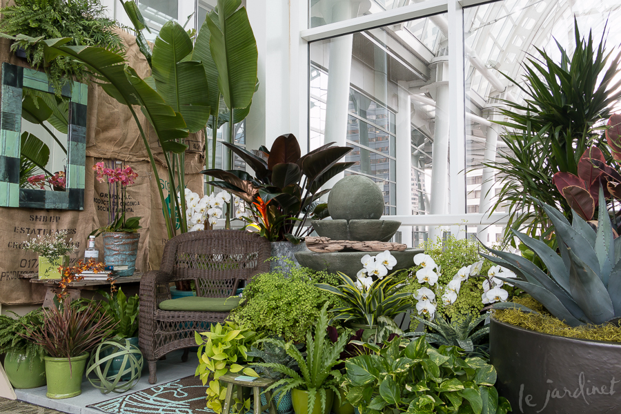
Best Plant Material: What's Your Cure for Spring Fever?
The criteria we were looking for included the following:
- Is texture of foliage carefully considered and effectively used?
- Are the foliage and flowers without blemish?
- Has grooming been done carefully?
- Is color carefully considered and effectively used?
Designer Lyn Robinson from Zenith Holland Nursery nailed it – and then some!
What we loved:
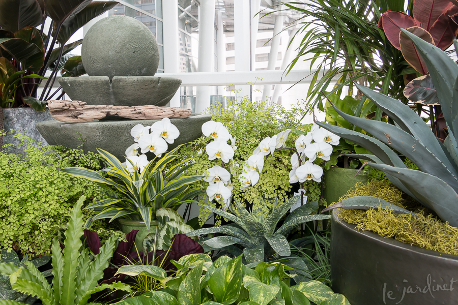
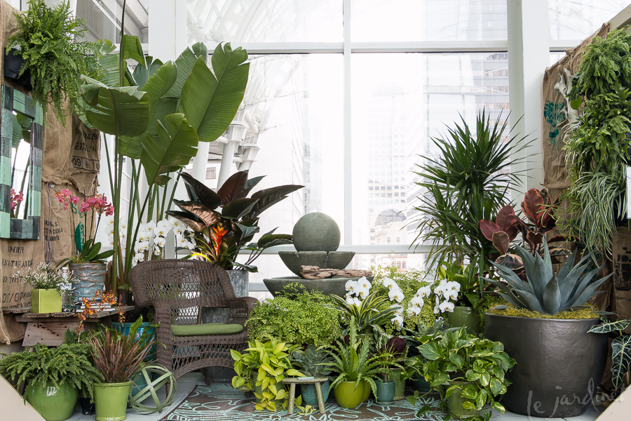
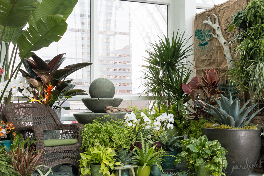
- The plant quality was exceptional – from frothy ferns to spiky agave and pristine orchids. This was honestly some of the best quality plant material we had EVER seen in a display.
- The color palette was exquisite. We loved the bright greens with smoky blues, while the dusty pink and burnt orange accents added just enough contrast to stop it becoming predictable. Notice how Lyn married the colors of every detail together from foliage and flowers to artwork, containers, and textiles. I wanted to move right in!
- Ferns and orchids are frequently used in displays – but it was genius to combine them with a spiky blue agave and tricolor rubber plant. GREAT texture contrast. In fact without that agave in the large pot balancing the taller banana the entire design would have felt flat, a design concept often misunderstood. They added drama, dimension and strength.
So why didn't it win Best Design?
I know some of you will be wondering! It was certainly short-listed, but it missed on two details:
- We felt that the creased, patchwork, burlap walls distracted rather than enhanced the design. A single layer of burlap would have worked – but this busy patchwork visually competed with the display.
- It needed more negative space- in other words, as stunning as it was, we didn't feel it was truly a livable space – it was just a bit too crowded.
It was, however, one of the most beautiful displays in recent years and managed to break away from the Asian/Zen-inspired theme just enough to still feel cohesive yet not contrived.
You can visit Zenith Holland Nursery in Des Moines, WA and be sure to follow them on Facebook.
Subscribe to Receive Blog Posts
Gardening inspiration delivered right to your inbox from Le Jardinet
This is a great piece! I was disappointed when I scrolled down for more and there were only two. Thanks for the early morning lift today!
Glad you enjoyed the post Joan. I could have written pages on each of the 10 displays but decided just to focus on the ones we gave awards to as it's not often judges have the opportunity to explain their rationale!
Love how you share what you liked about the design- and what we can do (what ideas we can “steal”). Thanks Karen!
My pleasure Jim!
For the Rock the Casbah, if it had been snowy setting of a home like now with the white of winter outside the windows, I feel the cyclamens bridge the space and bring the outside in 😊